| | Rise from Hell.. |  |
|
+3~Rockerdish~ Liquid C Kash2Smash 7 posters |
| Author | Message |
|---|
Kash2Smash
Administrator.


Posts : 574
Join date : 2009-07-24
Age : 30
Location : Sri Lanka
| | Subject: Rise from Hell.. Thu Aug 20, 2009 11:16 am | |
| just my new sig... 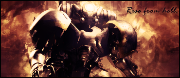 | |
|
| | |
Liquid C
GFX Designer


Posts : 106
Join date : 2009-08-05
Age : 32
| | Subject: Re: Rise from Hell.. Thu Aug 20, 2009 11:33 am | |
| Wayyy too dark, render isn't blended in, I think :s
And of course the text... | |
|
| | |
~Rockerdish~
GFX Designer

Posts : 147
Join date : 2009-07-30
Location : Octavarium
| | Subject: Re: Rise from Hell.. Fri Aug 21, 2009 7:32 am | |
| I hate it. It has nothing other than the render and almost all your tags are like that. MAKE SOMETHING DIFFERENT.
/If you post in this section, expect harsh comments. | |
|
| | |
Kash2Smash
Administrator.
Posts : 574
Join date : 2009-07-24
Age : 30
Location : Sri Lanka
| | Subject: Re: Rise from Hell.. Fri Aug 21, 2009 8:46 am | |
| meh.. lol rocker.. geez i'd understand if you'd have commented on flow or something else.. but still.. its pointless critizing on my my same style  remember the fact that i have just started making sigs like these, not even a month ago  i still made those pasting 4 pics into a 500x80 tw sig witha text on it. i have the right to test every single aspect of sig making there is possible | |
|
| | |
MinorDisaster
Global Mod.


Posts : 224
Join date : 2009-07-27
| | Subject: Re: Rise from Hell.. Fri Aug 21, 2009 12:25 pm | |
| Kash. You always do that style...but its not "your" style.
It's a simple smudge sig. You find it everywhere. And its not just that...it's way too simple. Make copy of renders....smudge them and layer them accordingly...slap on a grad map(I find you almost always use purple-orange)....then probably sharpen/blur for depth......then text. It's the good ol' routine. I have LOTS of those types of sigs...but then I started to use other techniques like liquify to create effects. You also lack C4D in your sig, and that is a sure way to create flow. Also try using stocks for BGs once in a while...or a gradient with some vectors. Remember, THAT style you are using does not define YOU, as you think. It defines LOTS AND LOTS of beginners.
As for that sig, there is no visible flow and very very very simple depth. Text is poorly placed and for that type of render(looking @ it like its sci fi-ish), you SHOULD NOT use a script text. Light source is also poorly placed and even with that, the lighting is buggish...use dodge/burn for a better effect. And its time to start venturing into different methods of lighting. 200px brushes were fine in the beginning but now you ought to think about lighting effects, lens flare etc etc. Also some bits of the render are way too dark. Make it seem like theres a shadow, but dont make it seem like there's nothing there o.o | |
|
| | |
Geopetal
CnC Crew

Posts : 285
Join date : 2009-08-09
| | Subject: Re: Rise from Hell.. Fri Aug 21, 2009 1:43 pm | |
| C4Ds and stocks.
Use them. | |
|
| | |
Radarr
Sig Maker.


Posts : 194
Join date : 2009-08-08
Age : 28
Location : Britannia!
| | Subject: Re: Rise from Hell.. Fri Aug 21, 2009 2:10 pm | |
| ^^ Lol You suck at CnC geo | |
|
| | |
Liquid C
GFX Designer
Posts : 106
Join date : 2009-08-05
Age : 32
| | Subject: Re: Rise from Hell.. Fri Aug 21, 2009 11:35 pm | |
| Yea, I'll just be honest, I don't like it at all. | |
|
| | |
Kash2Smash
Administrator.
Posts : 574
Join date : 2009-07-24
Age : 30
Location : Sri Lanka
| | Subject: Re: Rise from Hell.. Sat Aug 22, 2009 1:11 am | |
| thanks guys... PS: i swear to god that i did not rep rocker down for his comment | |
|
| | |
Kash2Smash
Administrator.
Posts : 574
Join date : 2009-07-24
Age : 30
Location : Sri Lanka
| | Subject: Re: Rise from Hell.. Sat Aug 22, 2009 2:13 am | |
| the thing is that u guys are thinking the background is smudged.. but actually, its not.. is displaced.. Distort>> Displacement... its a new tool i was trying out and its cool meh but i made some changes ... 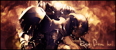 | |
|
| | |
Sexercise
Moderator.


Posts : 240
Join date : 2009-08-07
Age : 41
Location : B.C., Canada
| | Subject: Re: Rise from Hell.. Sat Aug 22, 2009 2:16 am | |
| lights, please. too bright XD | |
|
| | |
Kash2Smash
Administrator.
Posts : 574
Join date : 2009-07-24
Age : 30
Location : Sri Lanka
| | Subject: Re: Rise from Hell.. Sat Aug 22, 2009 2:20 am | |
| O_O some say its too dark.. and u say its too bright .. me giving up on this sig and trying some new one XD | |
|
| | |
~Rockerdish~
GFX Designer
Posts : 147
Join date : 2009-07-30
Location : Octavarium
| | Subject: Re: Rise from Hell.. Sat Aug 22, 2009 5:44 am | |
| It too bright at places and too dark at others.... ie contrast is v high. and i dont care about - reps. I am just helping you get better, you may acknowledge that or not.  | |
|
| | |
Kash2Smash
Administrator.
Posts : 574
Join date : 2009-07-24
Age : 30
Location : Sri Lanka
| | Subject: Re: Rise from Hell.. Sat Aug 22, 2009 5:52 am | |
| lol but i am serious i didnt rep u down. | |
|
| | |
MinorDisaster
Global Mod.
Posts : 224
Join date : 2009-07-27
| | Subject: Re: Rise from Hell.. Sat Aug 22, 2009 6:54 am | |
| Kash look @ the guy's left shoulder. It looks pixelated/messed up. Topaz perhaps?
And your V2 has that problem everywhere.
It's too bright in some, too dark in some. Use BURN/DODGE......Ditch the light source too......use render>Light effects | |
|
| | |
Sponsored content
| | Subject: Re: Rise from Hell.. | |
| |
|
| | |
| | Rise from Hell.. | |
|
